Once upon a time, touchscreen technology was the stuff of science fiction. Now, we’ve all gotten used to touchscreen design through our smartphones. But did you know touchscreens are becoming more popular in many other applications besides our phones?
Today people use touchscreens to punch time clocks, order food at restaurants, change car radio stations, use lobby directories, and so much more.
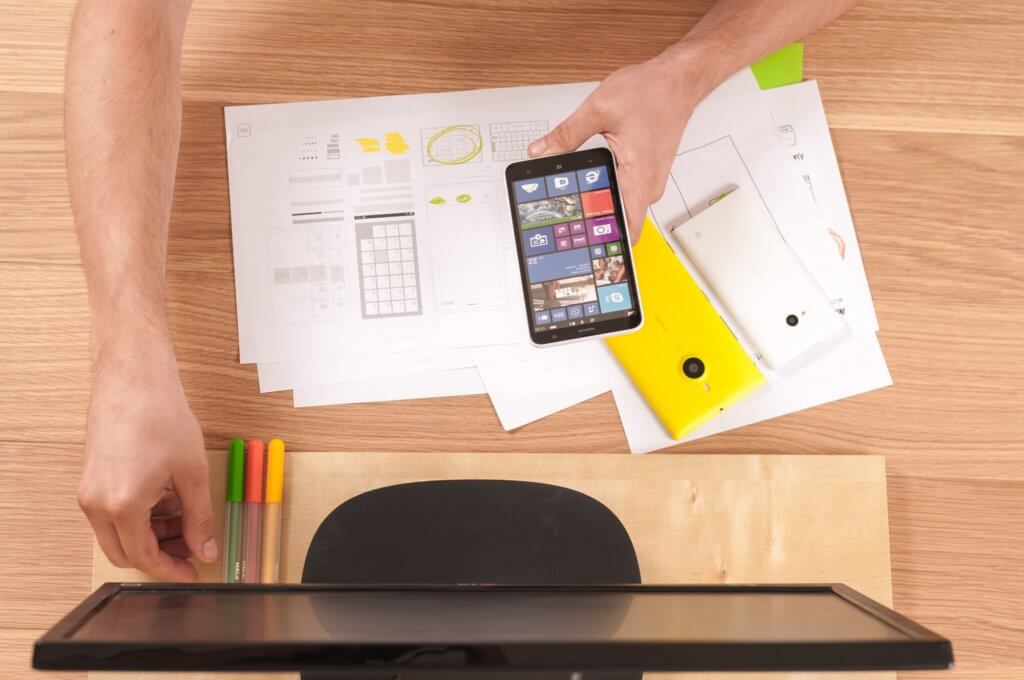
Good touchscreen design relies on visual cues like buttons, colors, and lighting. Because they are flexible and programmable, they’re perfect for incorporating into many types of products.
Here’s a look at why good touchscreens are important and how to max out your touchscreen design so you can increase your product’s appeal.
Use the Right Buttons
A well-designed user interface has features that are easy to understand, based on logical visual cues.
Buttons are the driving force behind all touchscreen interactions. Choosing the best size, colors, and 3D effects for your button design is important.
If you do this right, the user will want to push the right button to make a selection. Flat shapes can work well for getting the customer to act, but if your interface is hyper-realistic the likelihood increases.
Rely on Good Process Flow
Good process flow is logical, easy to understand, and guides the user to the preferred conclusion. If a touchscreen is poorly designed, the customer will have difficulty following the right series of steps to perform a task. This often causes frustration, loss of sales, or other problems that all businesses want to avoid.
All online processes follow a logical flow. A quality touchscreen will incorporate steps that lead the user through choices. During design development, you should be able to create a flow diagram or flowchart to describe the options on paper.
Use the Right Colors
The right colors can do a lot for your touchscreen design. You can use them to guide customers through an order or reinforce your branding onscreen.
Visual contrast is important for making touchscreens work. Since all touchscreens are flat, you should use colors, highlights, and shading to create a 3D effect.
Avoid Slow Response Times
The last thing you want for your customers to experience on a touchscreen is a slow response. They should be able to click a button and quickly observe the next step in the process, whether it’s an order going through or a new page opening.
If you can’t avoid a slight delay, use an hourglass or clock symbol to show that the program is working. This way your customers won’t assume they made an error or something is wrong with your program.
Don’t Crowd Elements
Adequate space on a screen is important because it allows the user to comprehend their choices easily. With or without glasses, many people will have trouble reading screens that have too much information or crowded font styles.
This is why you should keep your touchscreen layout uncluttered and use spacing to maximize communication. Also, it’s true that ugly websites lose business.
Make the Right Choice Obvious
When a customer tries to use a touchscreen, they should be able to navigate easily and without confusion.
There are ways to suggest the choice you would like users to make. You can do this subtly with the right object sizing and placement of interactive elements.
If you highlight or emphasize the preferred option with trigger elements, most customers will wind up selecting it at least once.
Don’t Overwhelm the User
Having to make a decision from too many similar options is never fun. It can cause doubt and anxiety about making the right choice.
You should always try to provide more than a few options for your touchscreen users, but be strategic. Overwhelming them could cause paralysis. It’s always better to narrow down the options to a realistic amount that they can handle.
Prevent Dead-Ends
The last thing you want to do is lead users of your touchscreen into a dead-end. This might happen if you haven’t thought through your program’s logical progression or forget to include a BACK button in the right place.
Be sure that no matter where they are in the program they’ll be able to keep moving forward. Provide next steps or an overview of the entire process that they can see and use for navigation.
Make It Readable
Readability is more than text size and spacing. Most of all, it means that your audience will be able to absorb what you are saying and it will make sense to them.
A key rule of thumb is to keep things simple and avoid overcomplicating what you want to say. If you use a flowchart to plan your program, it will be easy to keep clutter to a minimum.
Allow Users to Customize the View
Allowing your touchscreen users to customize their screens is always a plus. Customization can go a long way towards creating a satisfying experience.
Incorporating features like zoom, brightness options, and text size are all ways to help your customers get comfortable with what they see.
Increase Your Confidence With Good Touchscreen Design
Good touchscreen design makes a big difference for your business. It can influence everything from sales to how people perceive your company’s level of professionalism.
When you’re ready to design a great touchscreen system for your business, we can help. We’ve built an extensive portfolio of work using the best methods and technology available for touchscreen design.
We’d love to hear about your business goals and discuss how we can help you increase sales. Contact us today!